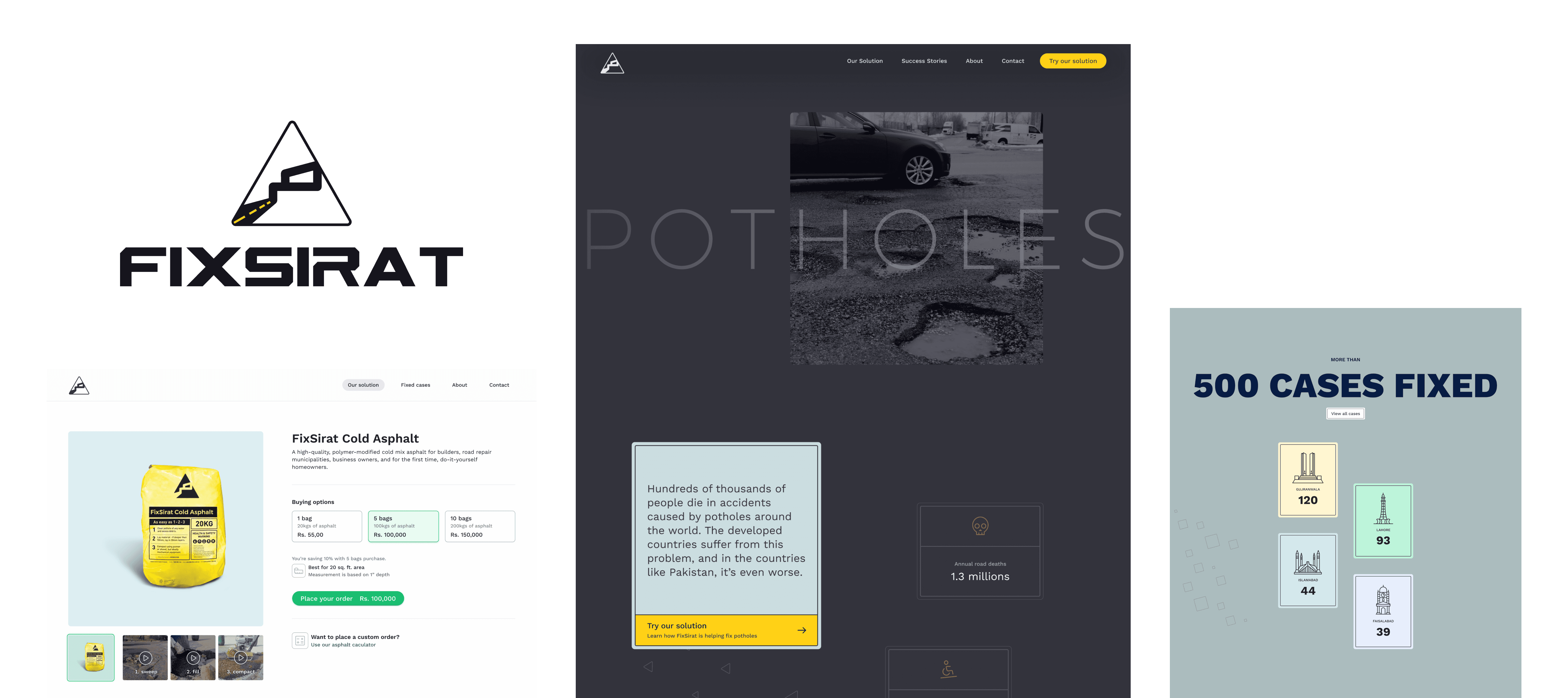
Committed to making a social impact by raising awareness to prevent pothole accidents and offering their cold asphalt product as a solution.
They contacted me to help them develop their brand strategy, visual identity, and web design.
Brand strategy
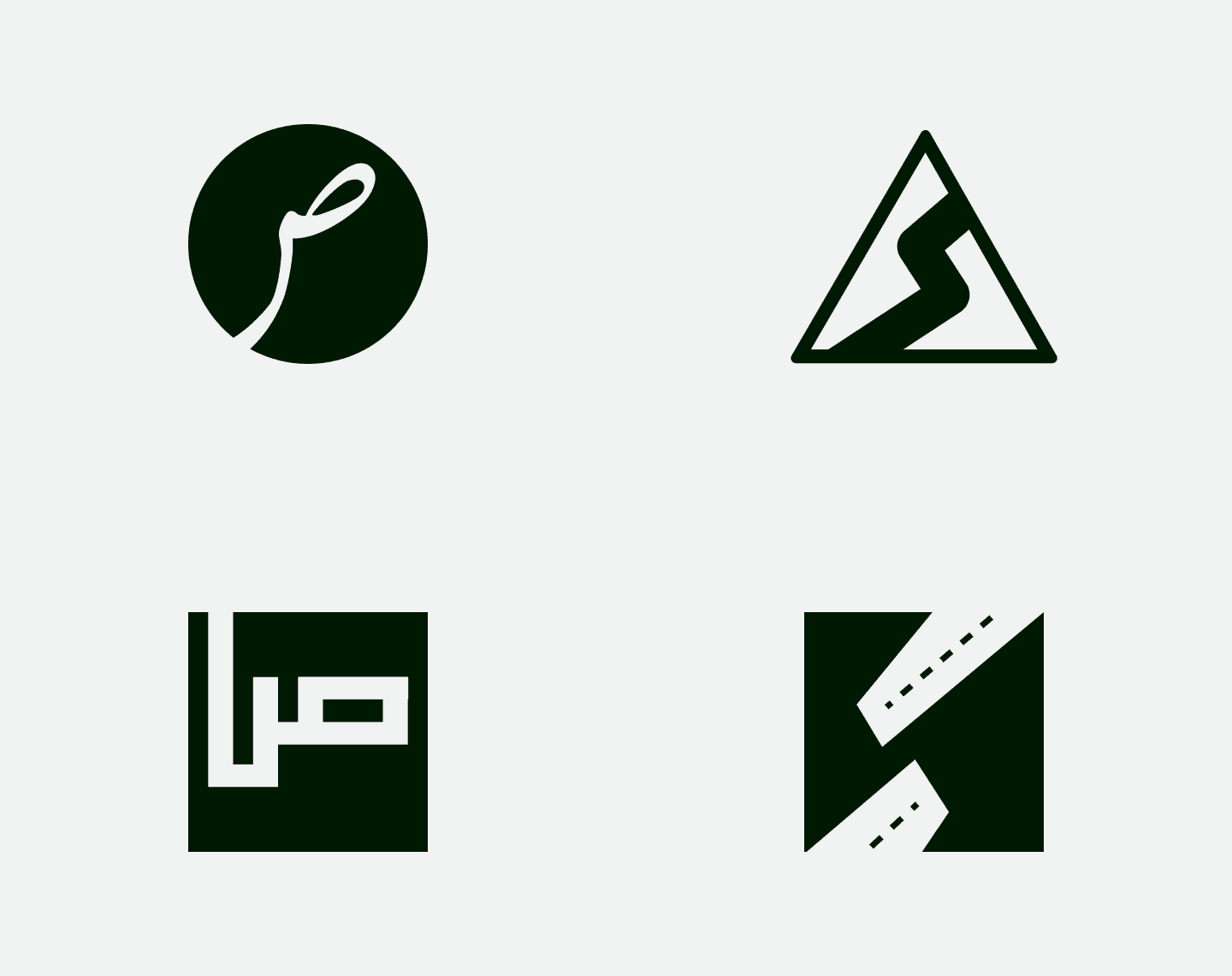
The name FixSirat combines the English word 'fix,' meaning to repair, with the Arabic word 'sirat,' which refers to a path.
Together, these words reflect the company's focus on providing solutions to fix roads and bring relief to people's lives.
The company was founded with the mission of making a social impact based on Prophet Muhammed (PBUH) teachings.
"Removing a harmful object from the road is a charity."
I worked together with FixSirat to help define the brand attributes as altruism, trust, social impact, and fairness.


The FixSirat logotype and mark were handcrafted to reflect the company's relation with roads and construction.
The logotype features bezel edges to give it a technical, industrial feel, while the mark is designed to resemble road signs.
The mark is also intended to stand out when used on other surfaces, such as cold asphalt bags.


The primary color palette for the brand consists of Corn Yellow, British Racing Green, and Dark Powder Blue, which is reminiscent of road signs and construction.
The supporting colors are Smokey Grey and Storm Cloud Grey.


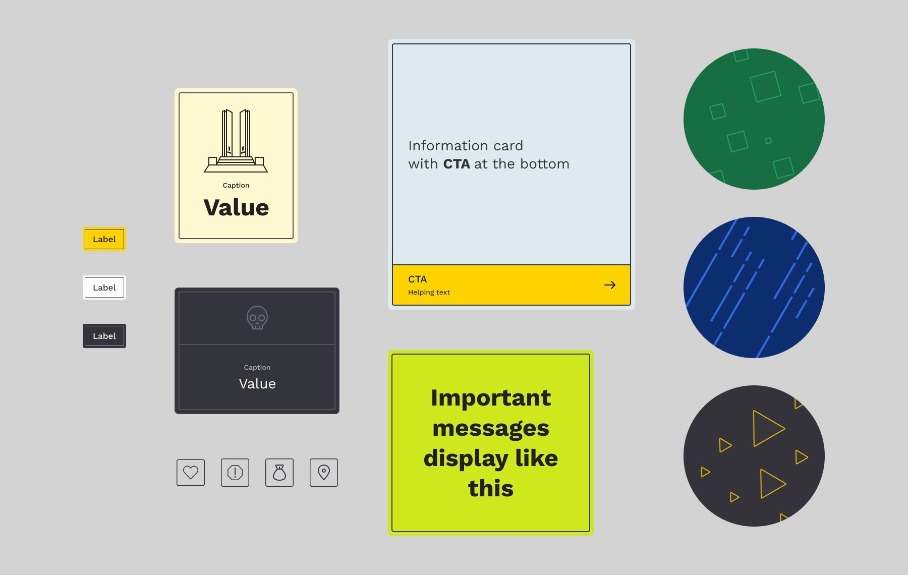
My goal was to create a trustworthy and informative website with a theme that evokes the feel of roads, signs, and construction.
I used visual language patterns, styles, and components to guide the user through the page while maintaining a consistency.


MORE PROJECTS